Henry.tax
Balancing utility and delight to take the anxiety out of filing taxes online
The best of both worlds: digital price, human support
Our client approached us with an idea: a tax prep service offering customers real accountants working remotely. By positioning the product in-between cheap (but low-confidence) digital software and bespoke (but expensive) accountants, they could offer customers the best of both worlds: the peace of mind of working with a tax professional, at a price point just above popular tax prep software.
Researching customers' tax journeys to spot opportunities
We all know first-hand how taxes provoke anxiety. But to sharpen our approach, we wanted to speak with past users of tax preparation software to learn about their problems.
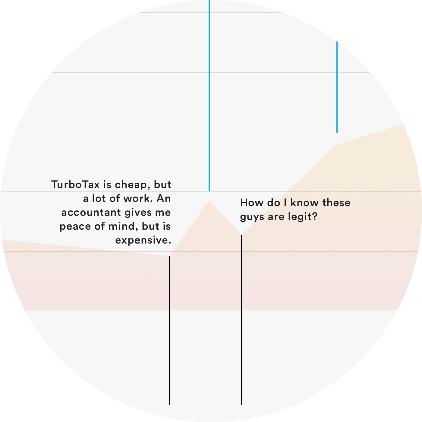
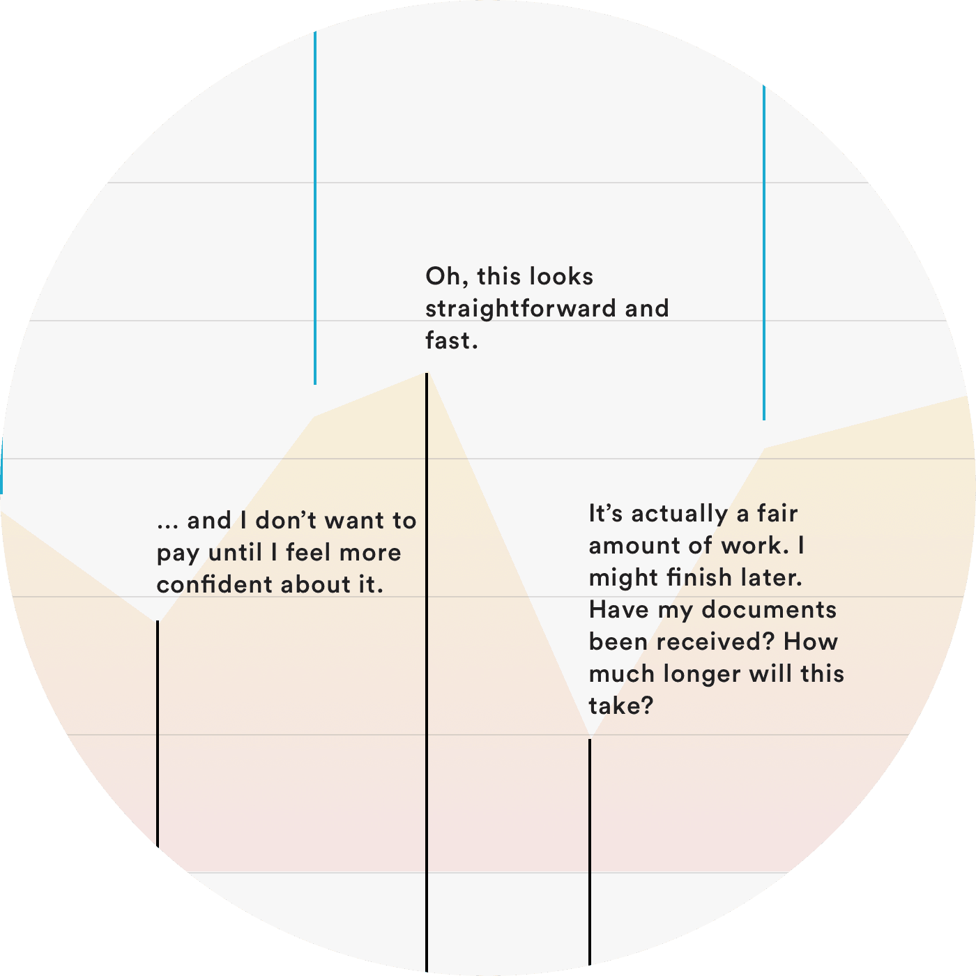
We heard anxiety around being asked to pay before understanding the full process, data integrity and continuity over over multiple sessions, and the ability to self-serve but get human support when needed. We mapped out a customer journey diagram, which then fostered conversations around product opportunities.
Customer Journey Map informed by customer research.
Demystifying an intimidating process via navigation
To address needs we heard in interviews, we explored designs for a portal that would quickly communicate the value proposition, make process continuity (and document storage) seamless over multiple sessions, and facilitate customer-accountant communication — all with the goal of bringing customers back year after year.
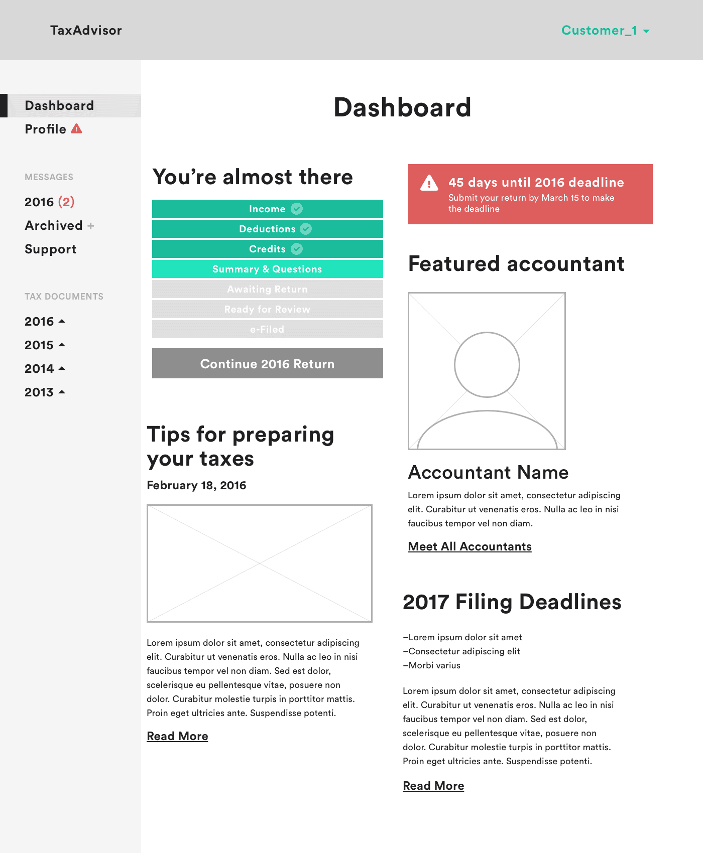
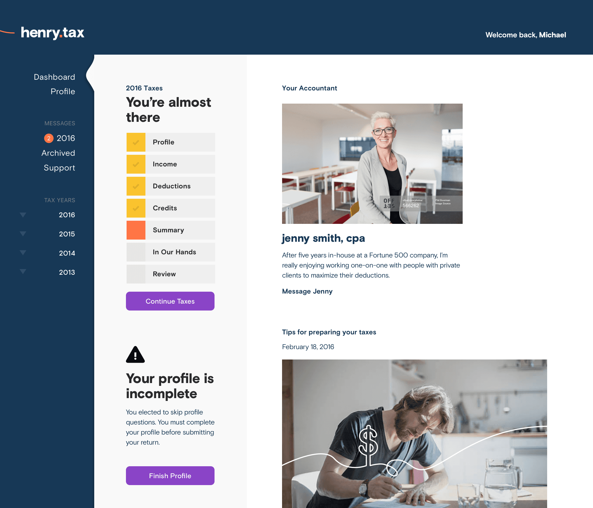
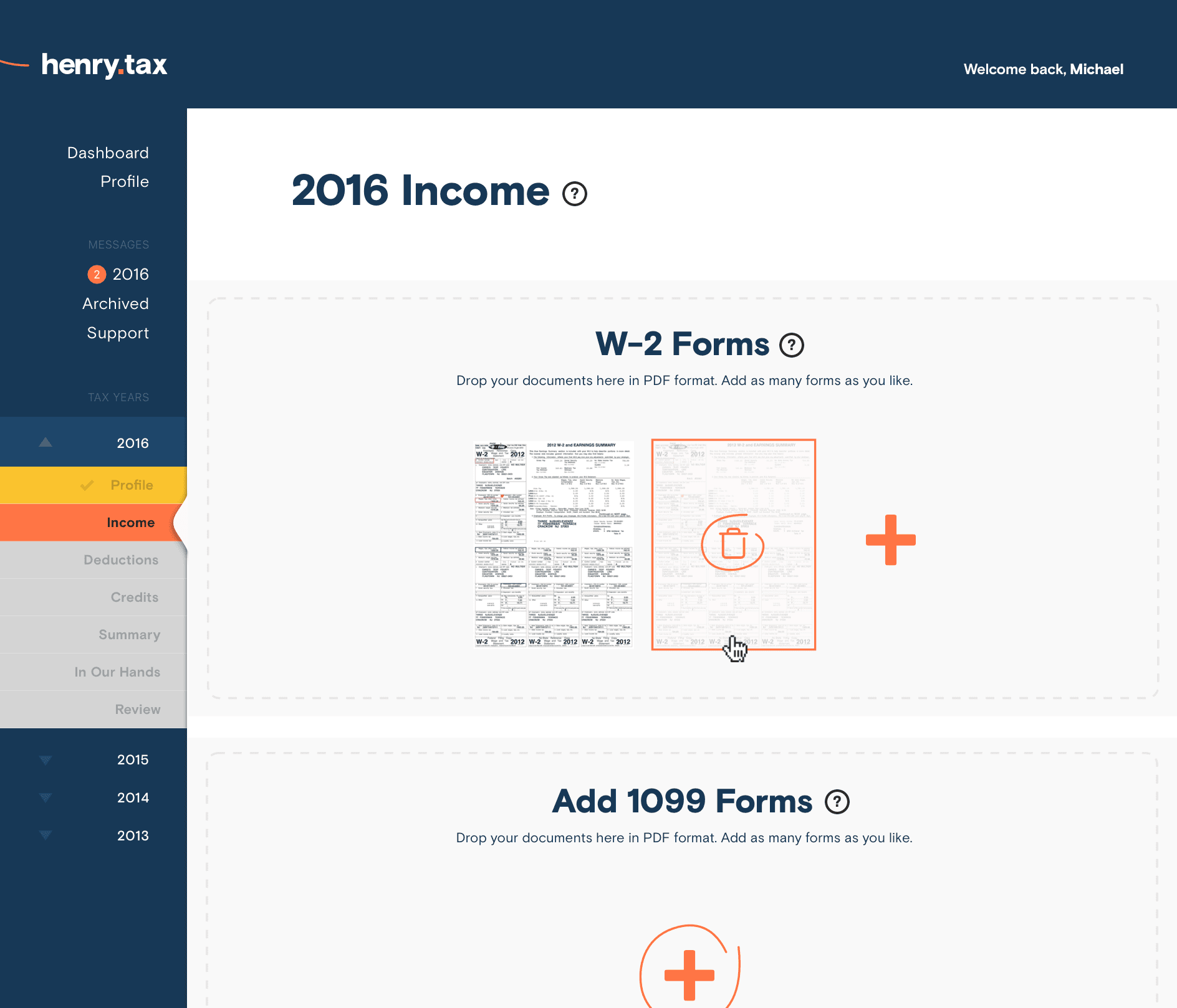
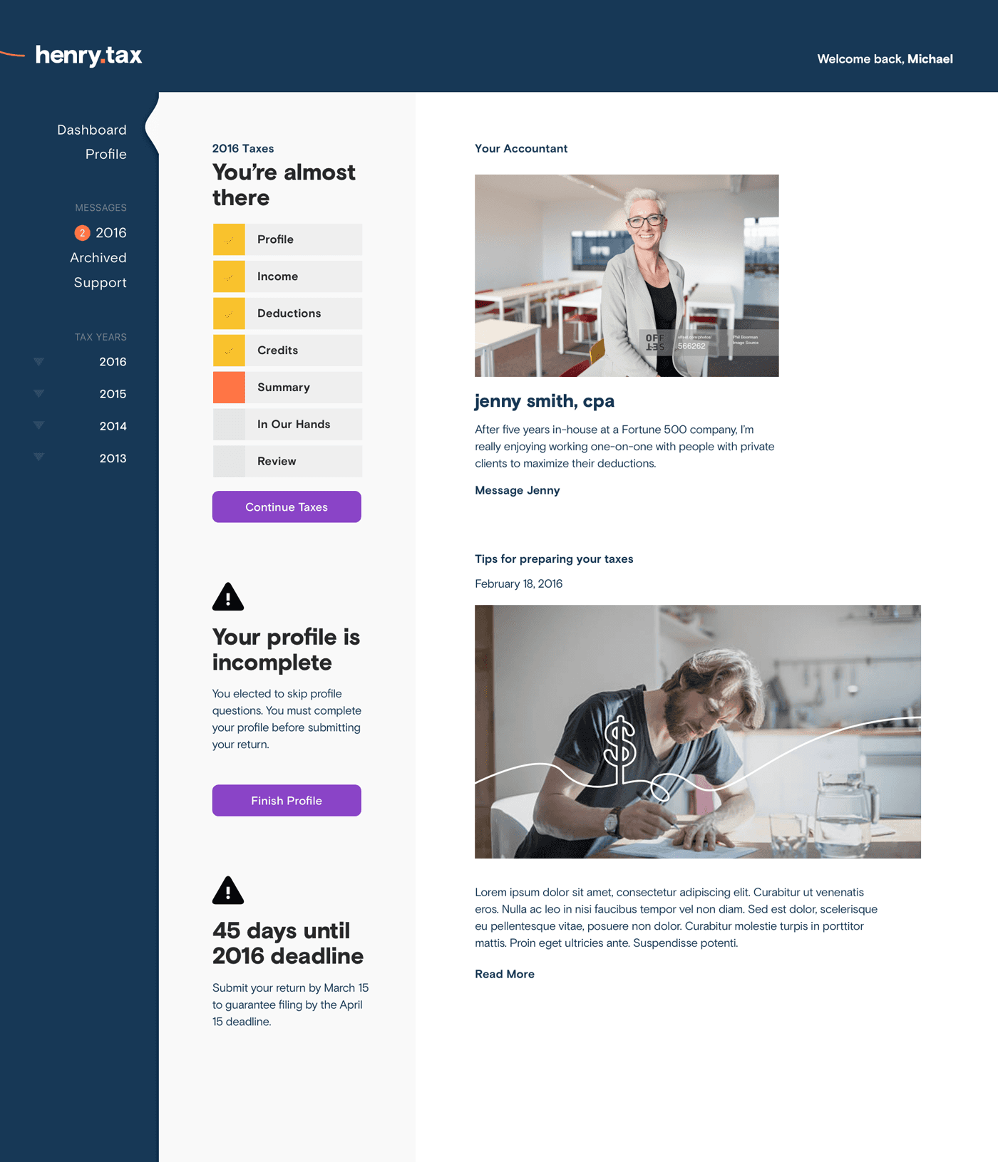
Chief among these concerns was quickly communicating a multi-step journey in a way that matched people's mental model, and allowed them to jump back and forth as necessary. We achieved this with a simple left-rail utility nav that clearly communicates complete and incomplete steps.
Left-rail utility navigation quickly communicating progress status.
Left-rail utility navigation quickly communicating progress status.
Simplifying upload with intuitive drag-and-drop interactions
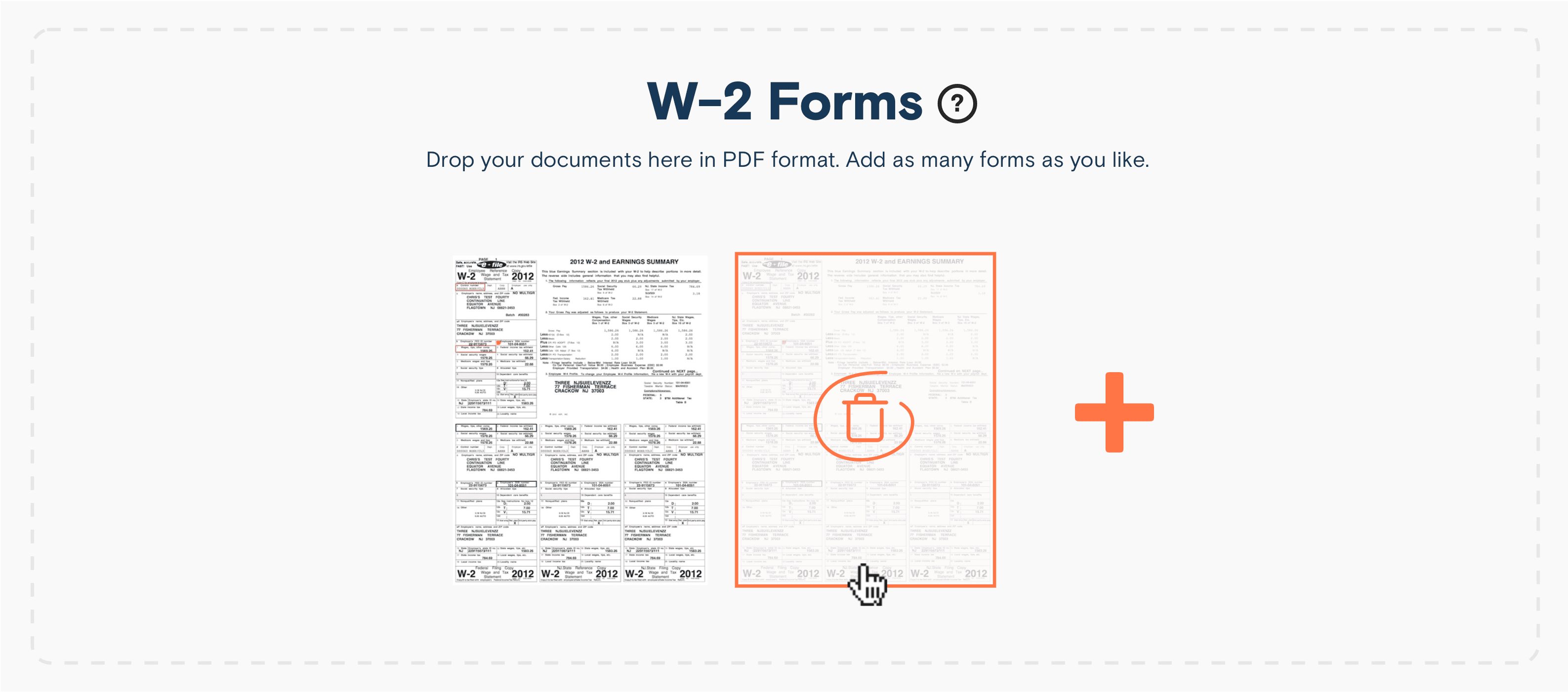
We heard a surprising amount of confusion around uploading documents — specifically, not knowing whether they'd been uploaded successfully, especially for multiples.
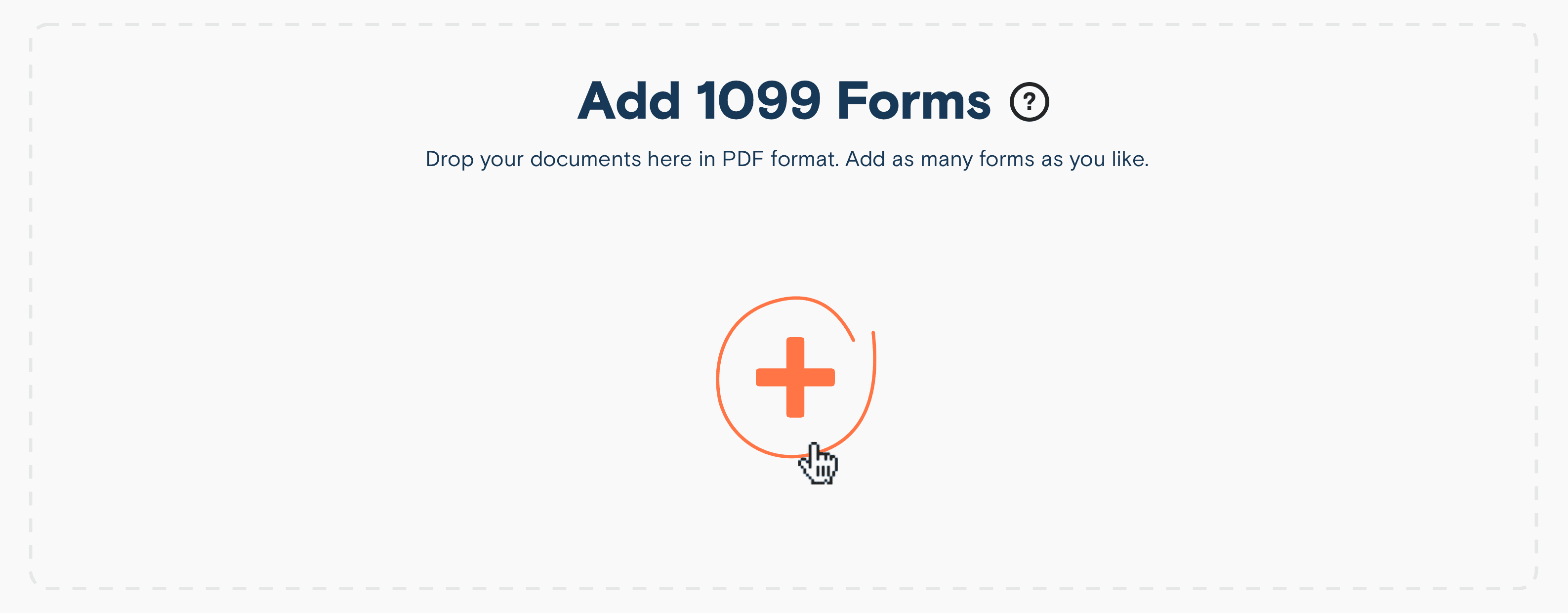
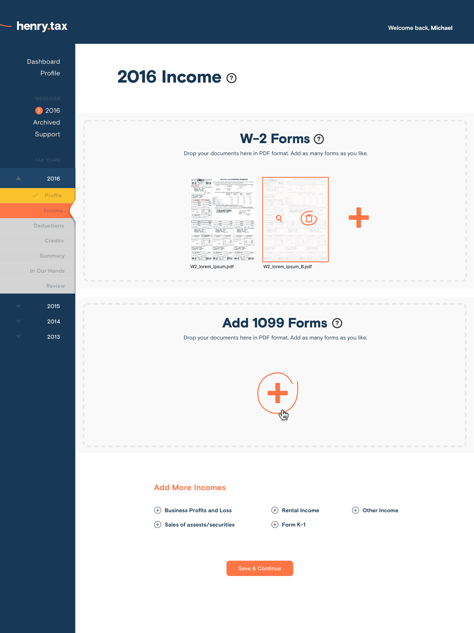
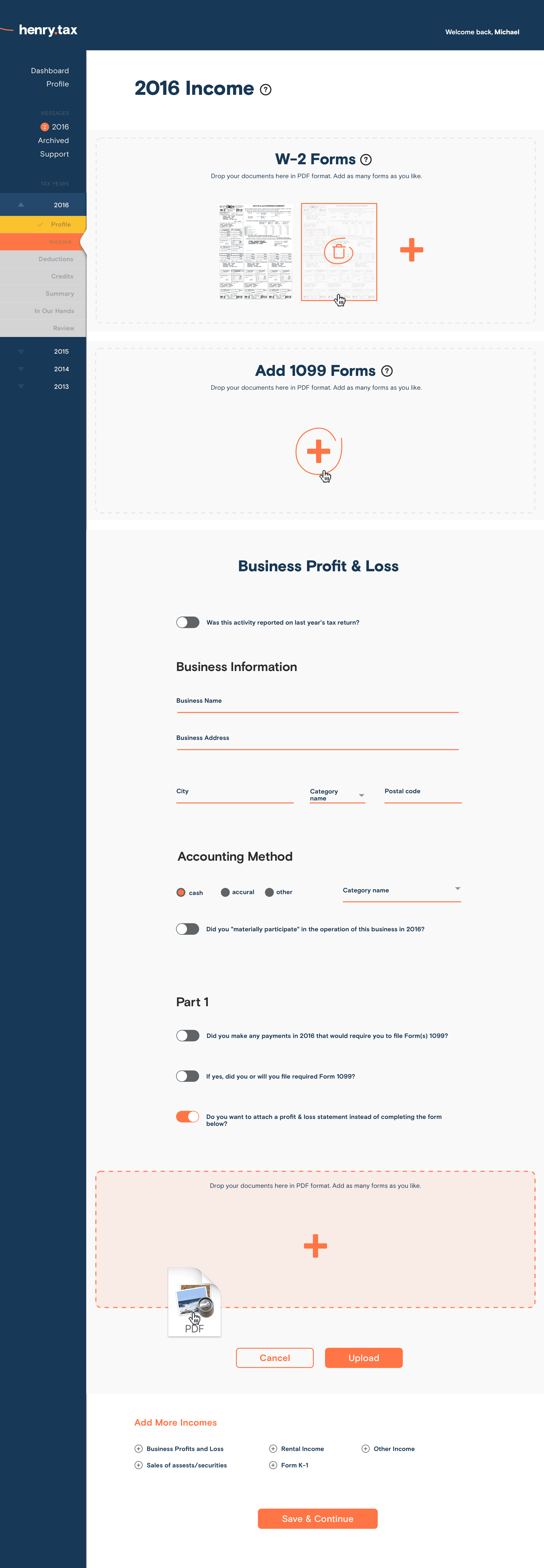
So we designed and built an intuitive drag-and-drop interface that would have a minimal learning curve, and visually confirm which documents and pages had been uploaded.
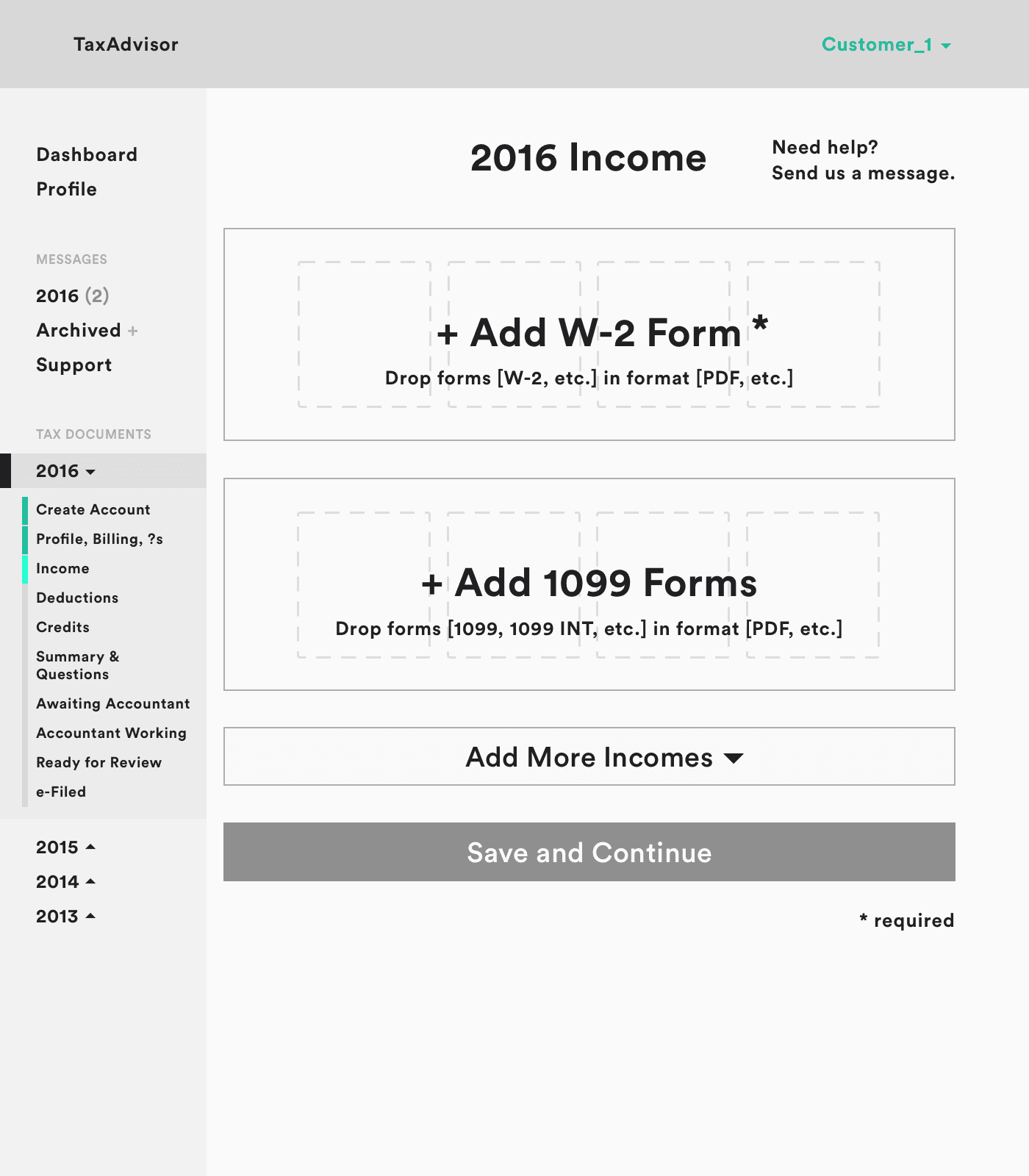
Initial study showing standard upload.
Later studies showing drag-and-drop interaction with visual representation of uploaded documents to communicate status.
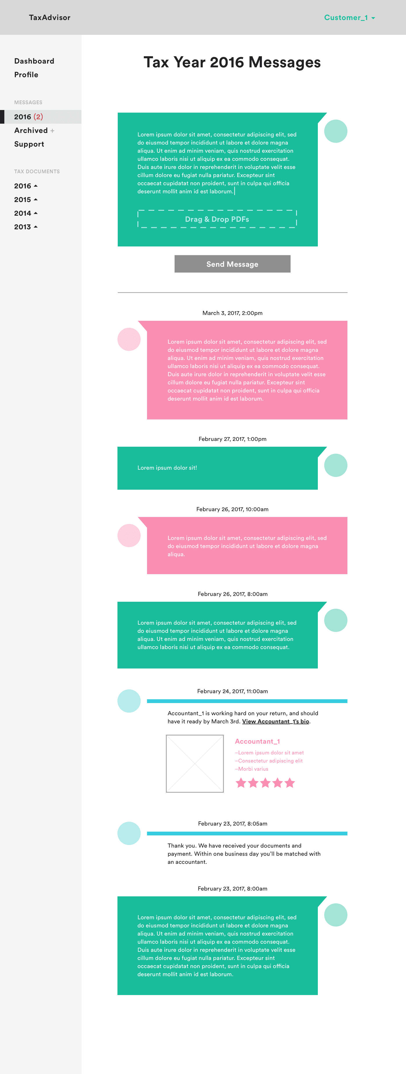
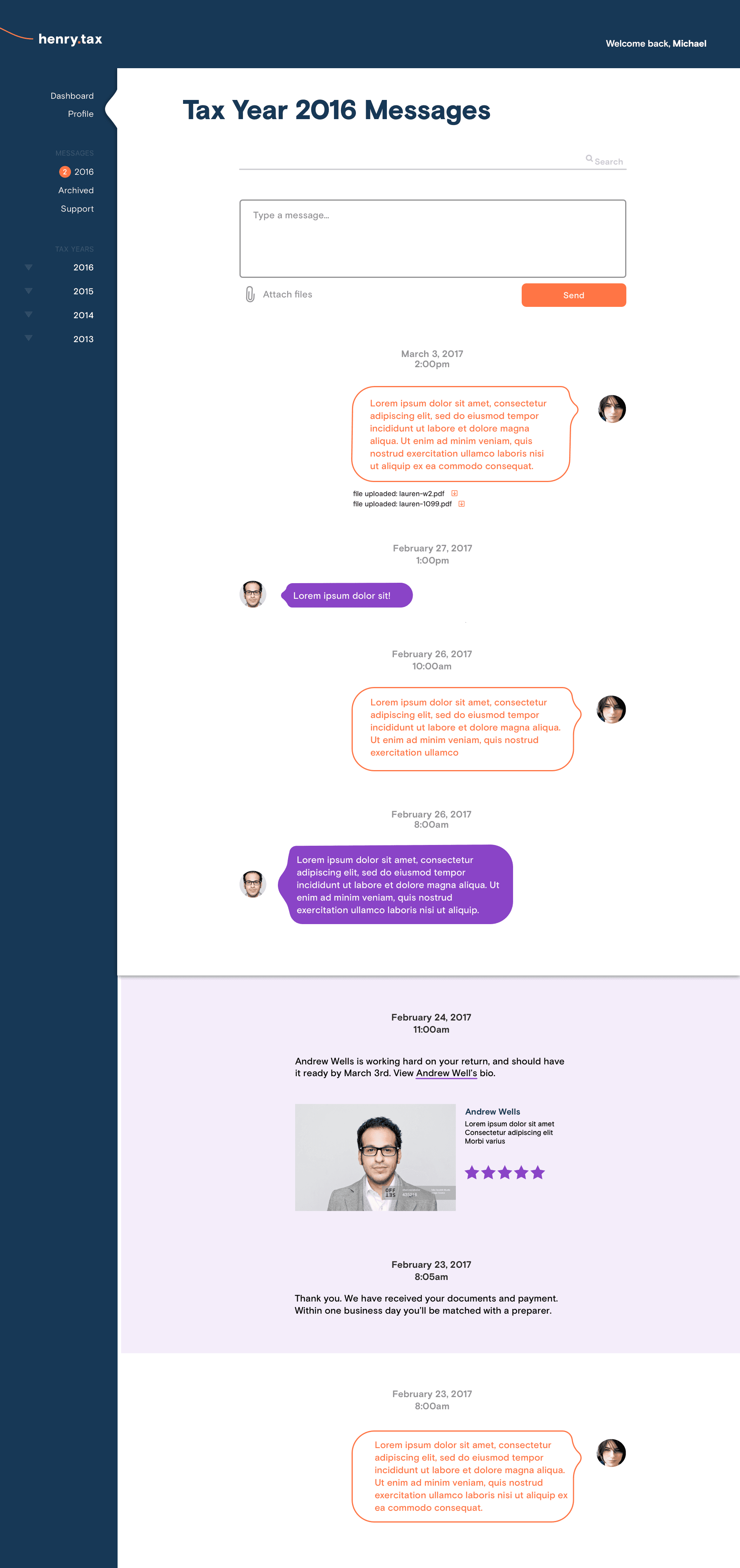
Accountant conversations, threaded by tax year
Finally, we heard a lot about the pain of getting help from an actual human — either combing through past messages with an account or just getting someone on the line in the first place with services like TurboTax.
We made our accountants easily accessible via a 'Messages' bucket in the left rail, and organized correspondences as extended threads organized by tax year.
Left-rail utility navigation quickly communicating progress status.
The outcome? A splash in national media, and a strong user base from day one
Our portal tested well, and — riding on a feature in The New York Times — helped our client hit his first year customer acquisition goals. The rigorous research we undertook helped the product achieve a successful launch, establishing a foundation to progressively iterate upon for future tax years.
Landing Page
….cont.
Onboarding
Document Upload
…cont.
Messaging


