Gibney Dance & Wayfinding
Building a scalable design system to showcase a dynamic dance offering
Audiences weren't finding what they didn't know they needed
Gibney are known as a dance company, but their programming extends beyond performance to movement classes, services for artists, and workshops for survivors of domestic violence.
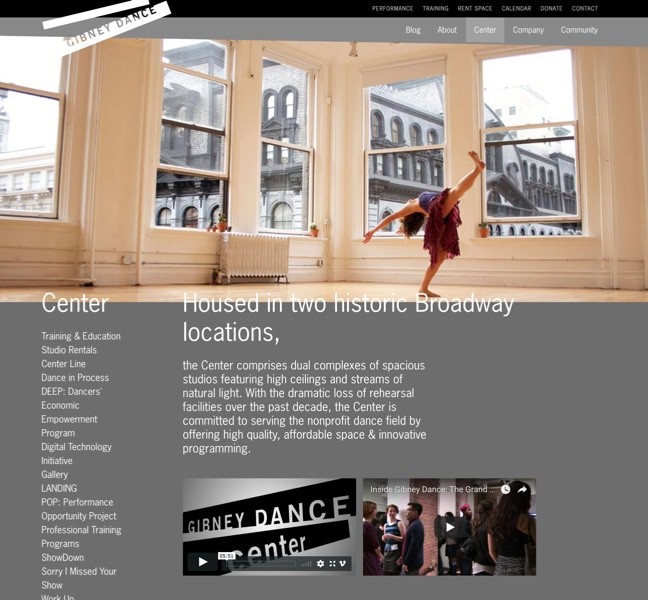
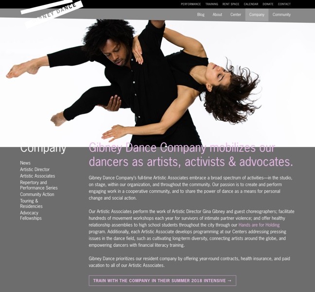
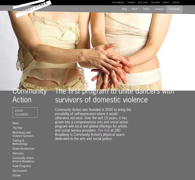
Their old site’s information architecture was organized around “The three Cs: Center, Company, Community" — broad categories that confused the public and couldn't intuitively categorize their programming.
We were asked to:
Reimagine Gibney's information architecture, and use that to improve the user experience
Tell the Gibney story clearly, completely, and with emotional punch
Previous site: difficult to read, poor wayfinding, no calls to action
Researching audiences to understand their Jobs-to-be-Done
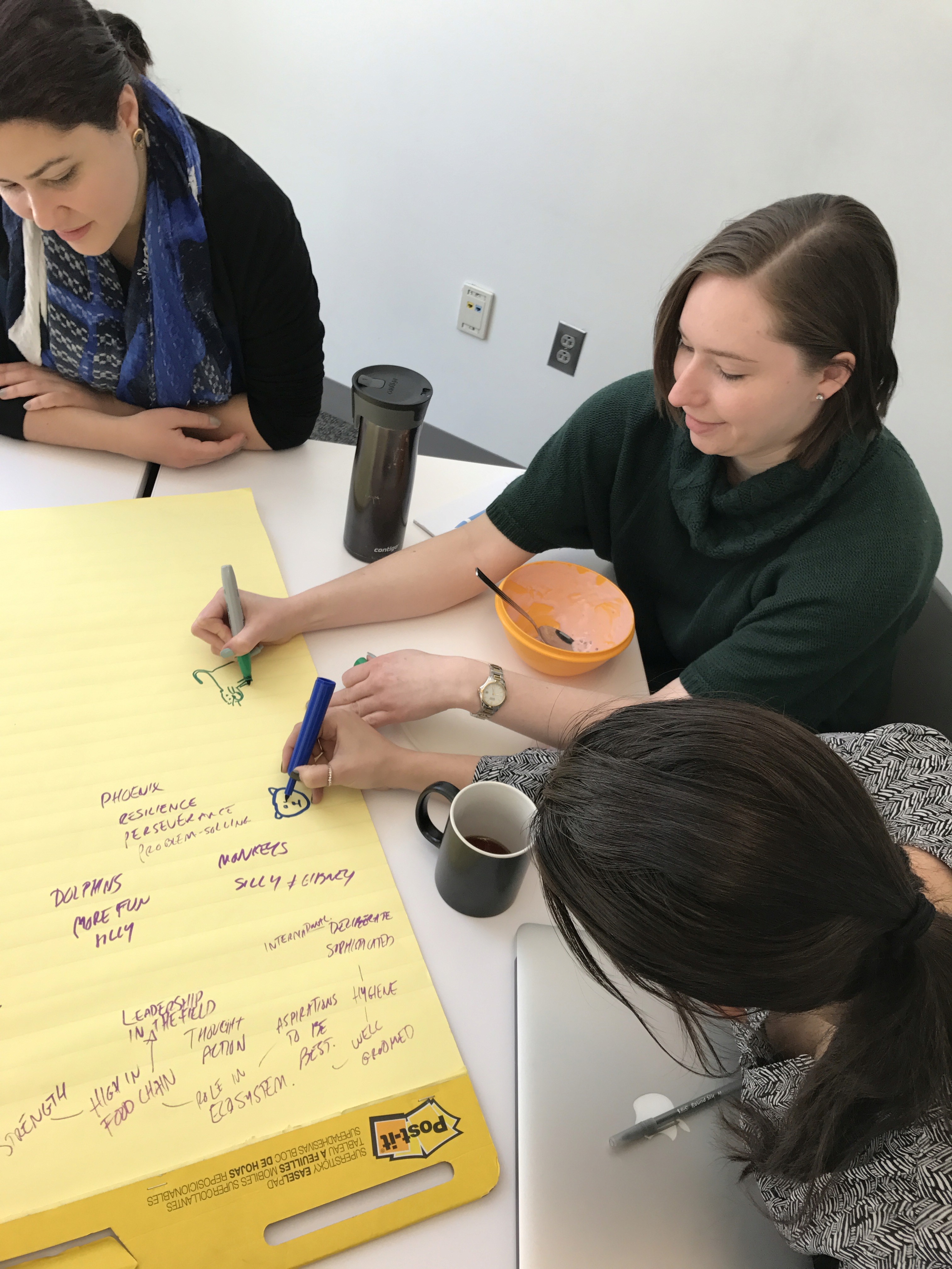
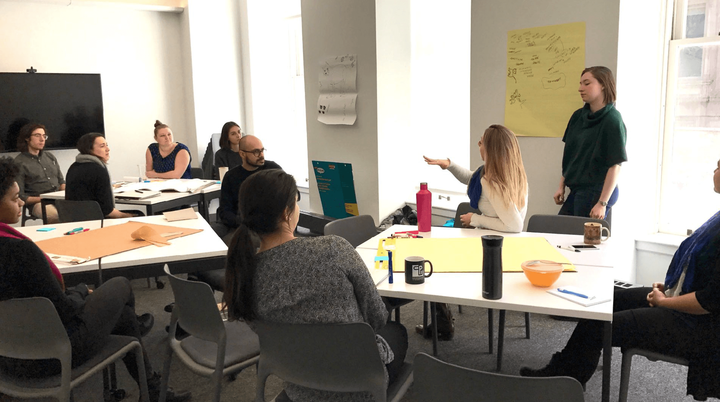
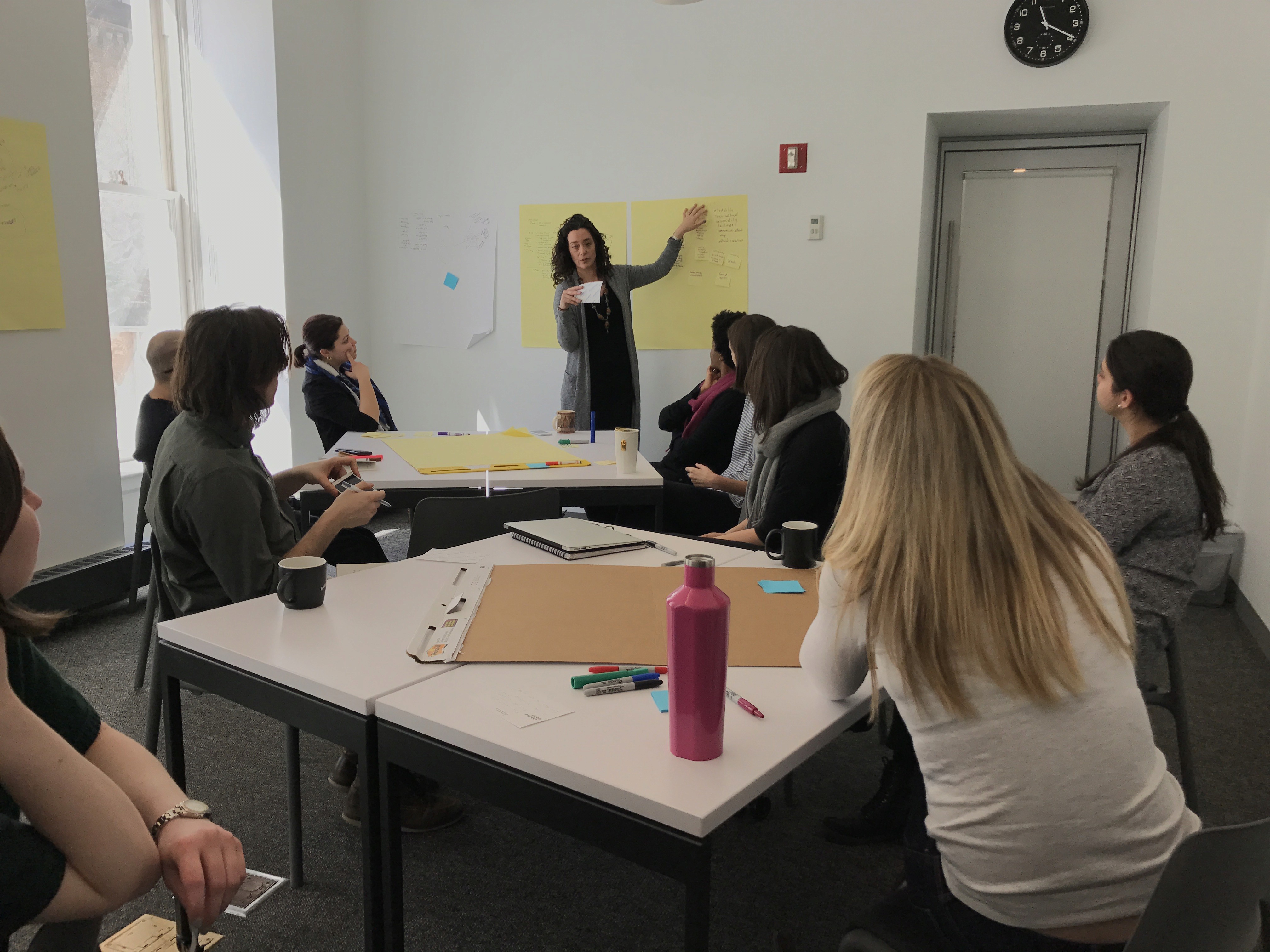
To understand specific audiences' needs more deeply, we conducted co-creation workshops and interviews with Gibney staff, company members, and class instructors — as well as members of the public who had attended performances or accessed services. Some prompts we considered:
How does Gibney Dance communicate with you?
How do you find out about its work?
What aspects of the organization could be better communicated? How?
Who are Gibney Dance’s primary audiences / targets?
What are their needs and expectations when it comes to Gibney Dance?
It emerged that both stakeholders and users perceived Gibney’s offering in terms of the task they came to the site to do: purchase tickets, reserve a class, rent a space, etc.
In short, Gibney’s information architecture didn’t match most peoples’ mental model of their programming. We also uncovered basic usability issues with features like the calendar.
Co-creation workshop with Gibney team.
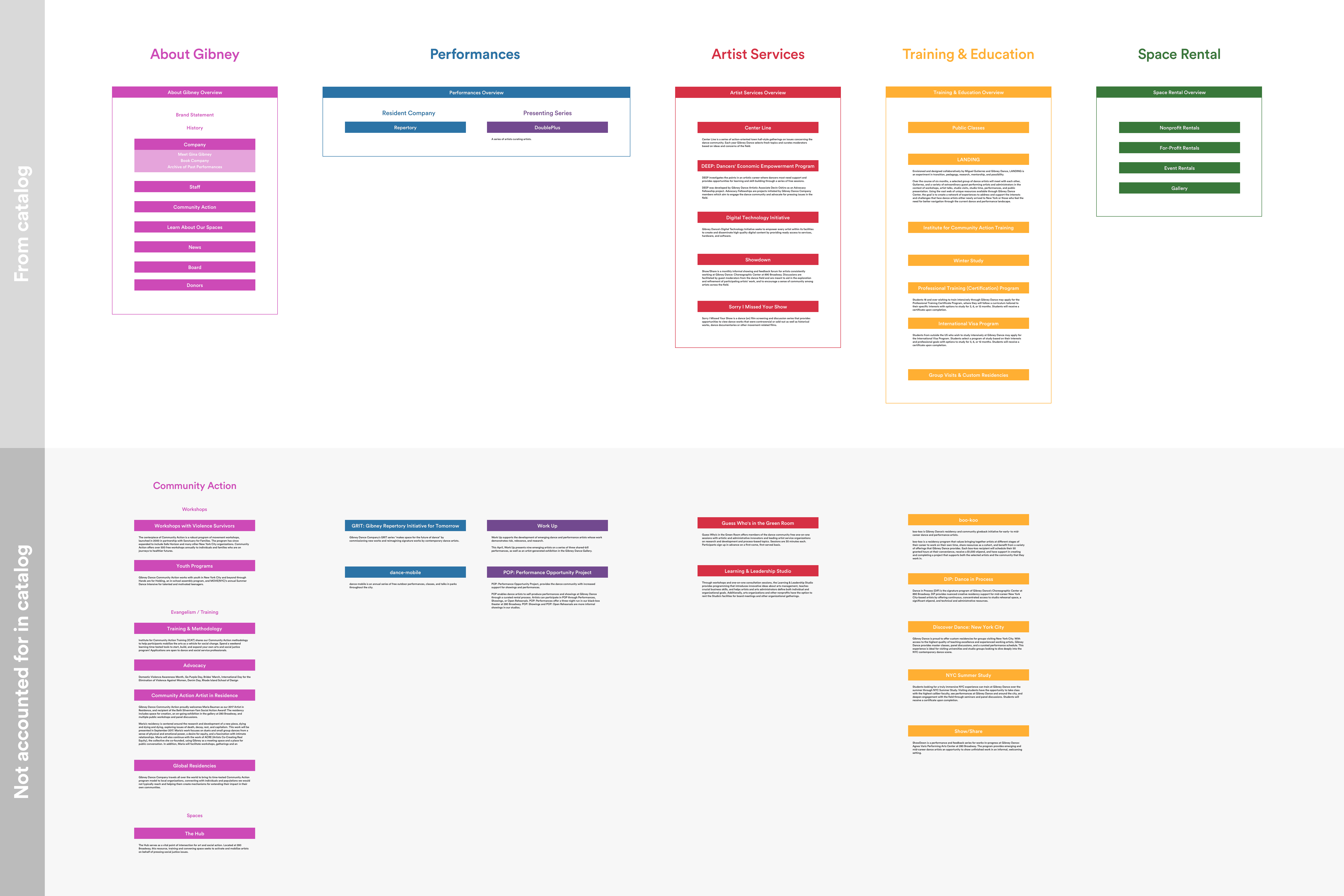
Using insights that emerged during our conversations, I established a new information architecture based on the ‘jobs’ (tasks) users wanted to perform. For example, I broke the previous IA category of 'Center' into Classes, Artist Services, and Spaces — three specific tasks for very different audiences.
I exhaustively catalogued every program, performance series, person, residency, service, and event type at Gibney, and finalized an updated site map based on user feedback.
Updated site map & information architecture
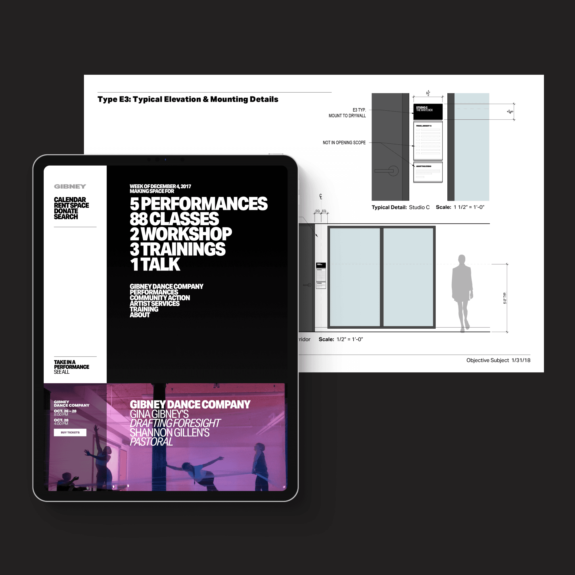
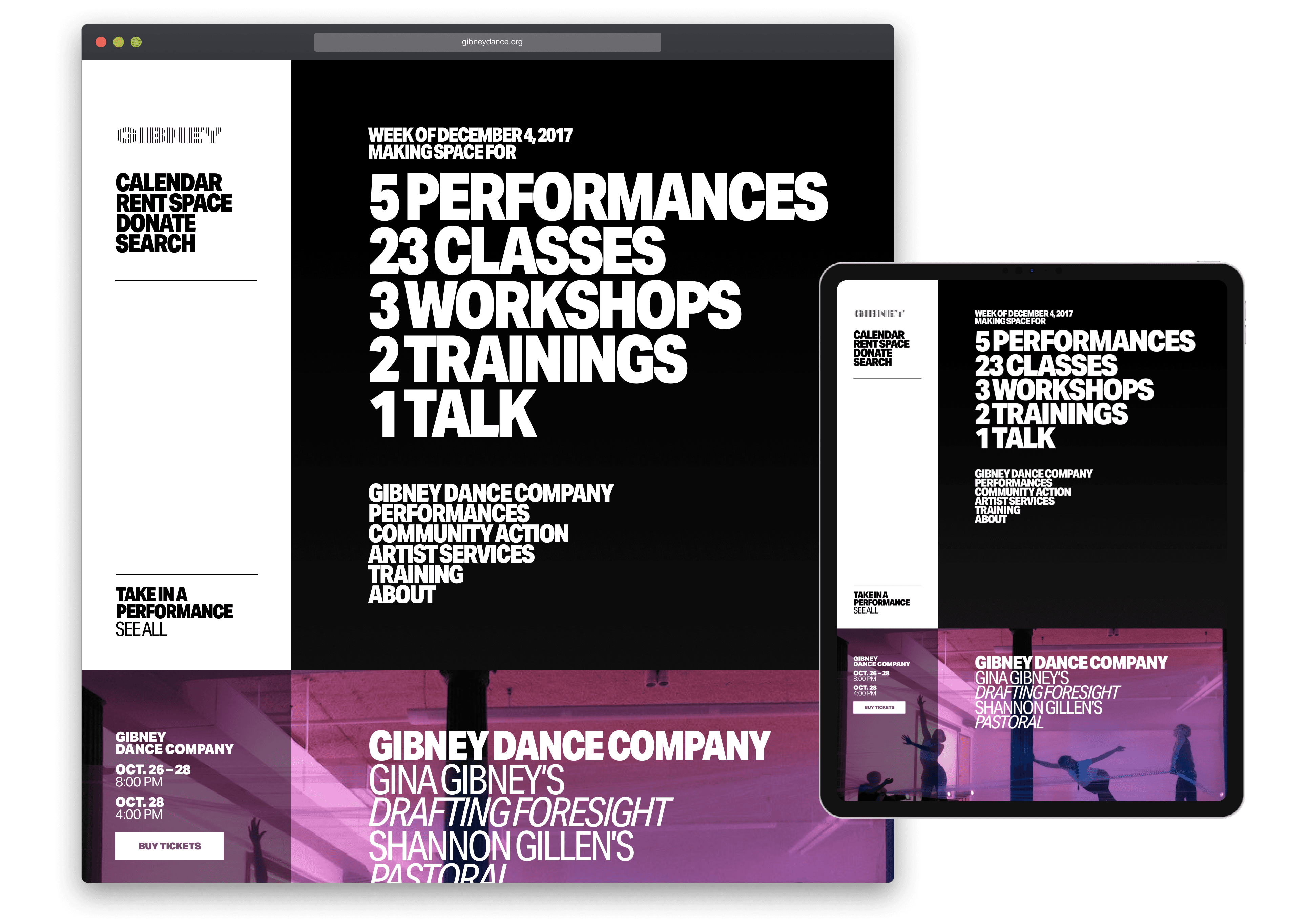
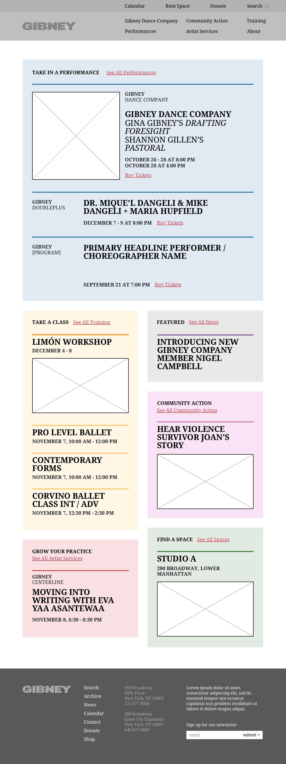
A dynamic ticker homepage to showcase weekly offerings
From the outset Gibney expressed a desire that the homepage instantly communicate Gibney’s diverse movement-centric programming. We thought this would be powerfully communicated by simply showing the number and range of programs on the calendar, so we designed a live 'ticker’ for the top of the homepage which tallies the upcoming week’s events — broken out by category.
Key functions, like the calendar, and utility functions like Rent Space, Donate, and Search were put front and center in a white bar that hugs the left side of the browser.
Homepage quickly communicating Gibney's sprawling programming.
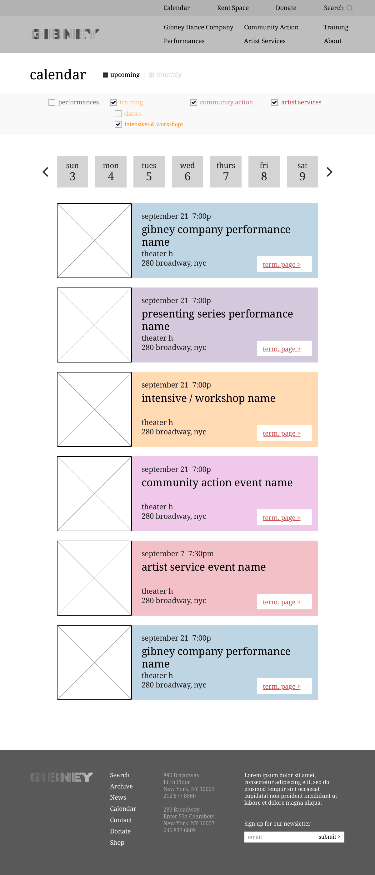
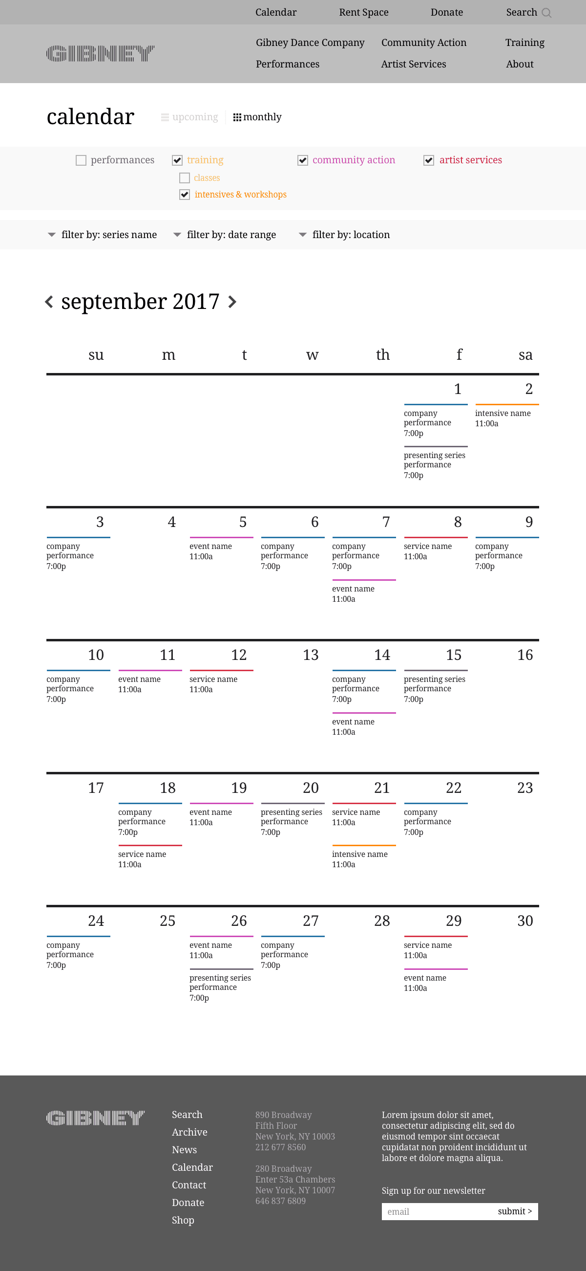
A usable, bi-format calendar
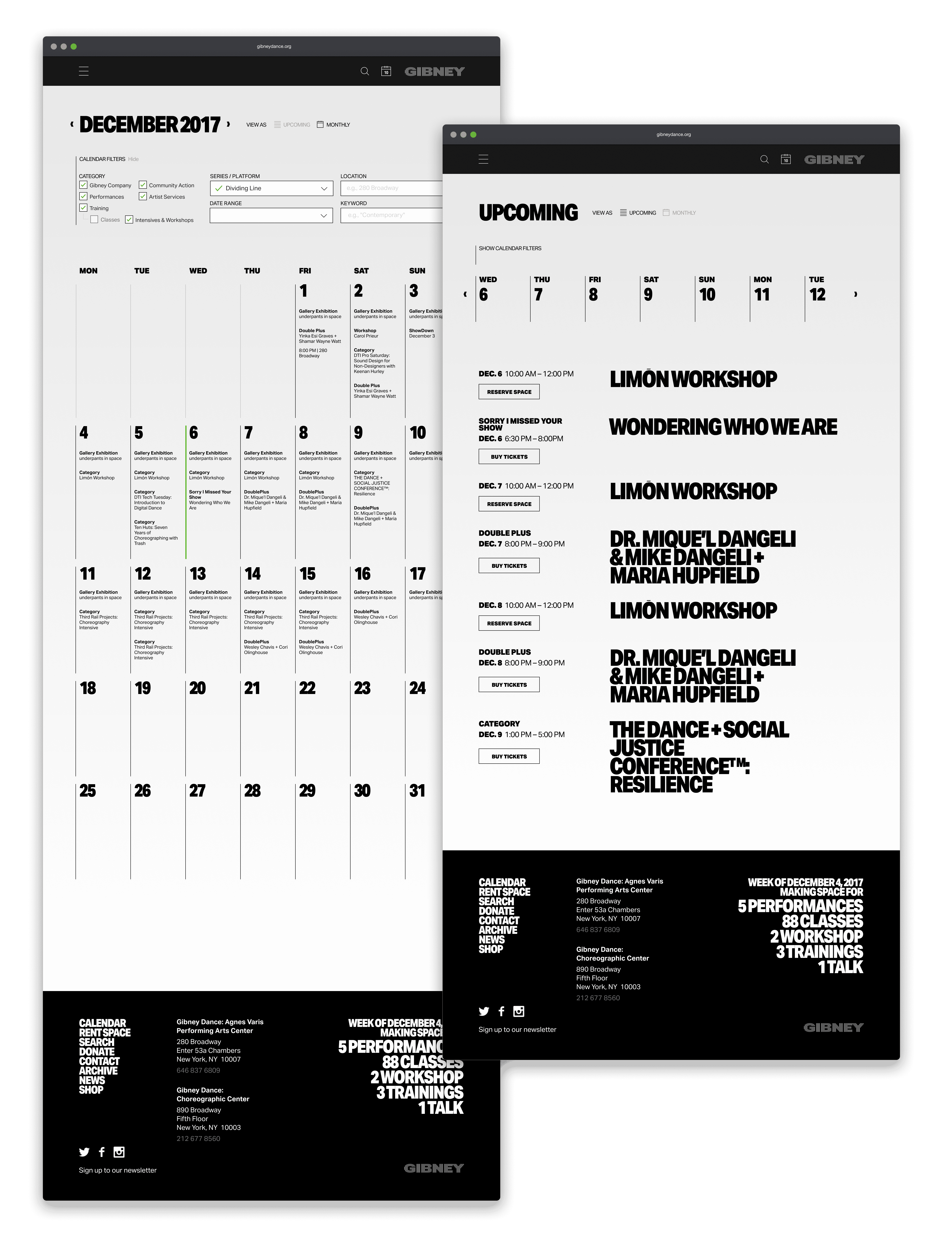
Because the calendar is such an important tool to showcase Gibney's offerings, we paid special attention to it. Based on conversations during research, I designed to formats for different browsing styles — a straight grid calendar, and a list view.
We did usability testing for both approaches and refined design and interactions.
Bi-format calendar for viewing a grid or list view of programming.
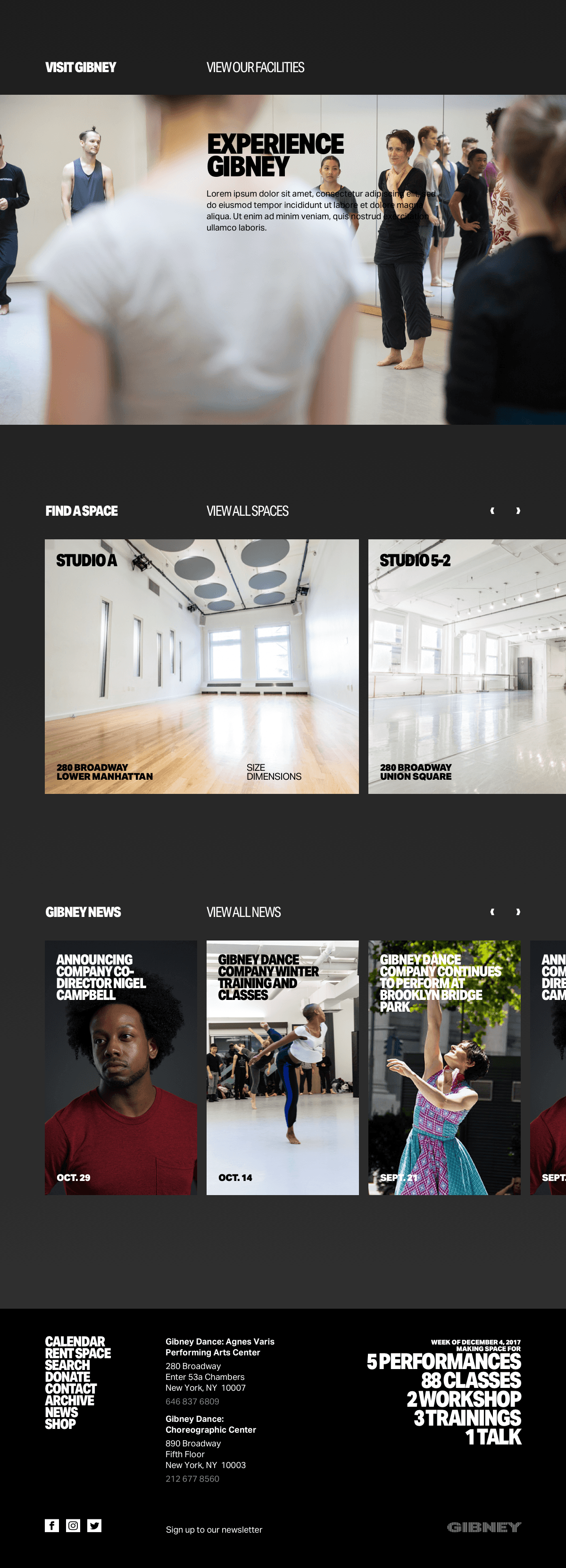
A flexible, expressive design system
As I iterated on wireframes, I kept in mind the scalable, resilient design system we would ultimately need to build — individual content modules that could be assembled into full pages as necessary to accommodate Gibney’s diverse programming. Once the basic structure of the system came into view, we extended the visual language of our brand refresh to the content modules.
Design system modules accommodating a wide range of content types and layouts — and incorporating refreshed Gibney brand identity.
The outcome? An increase in programs per visitor — and ticket sales
Our solution increased overall ticket sales and, more importantly, the number of programs each member of the Gibney community participates in.
In qualitative surveys, audience members reported knowing more about the organization as a whole, as well as individual facets of its programming.
Our design solution communicates Gibney’s mission and full offer legibly and powerfully, and helps the organization achieve their internal objectives by making it easier for users to achieve theirs.
Homepage
….cont.
Landing page
Calendar (list)
Calendar (grid)
Design system
….cont.
Landing Page
….cont.
Onboarding
Document Upload
…cont.
Messaging
